

AAPI Democracy Project
AAPI DEMOCRACY PROJECT
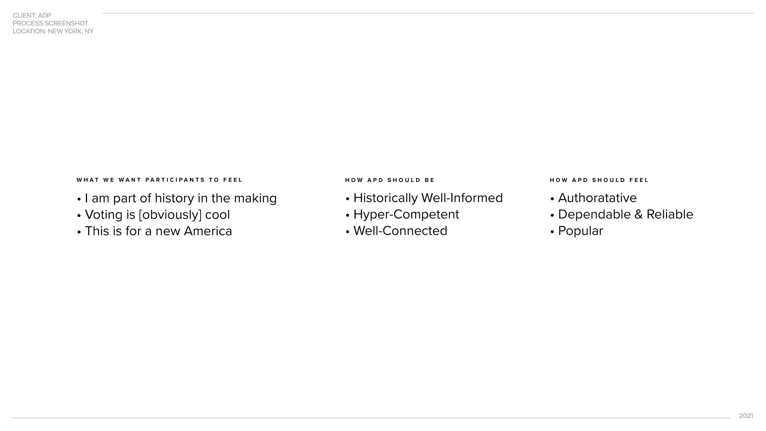
ADP is a non-profit dedicated to the empowerment of the AAPI vote. They needed help creating a brand that could feel strong, competent, and potentially convey Asian American tones without being cliche.
Deliverables:
• Logo
• Brand Assets
• Website

FINDING DIRECTION
Breaking the Bracket
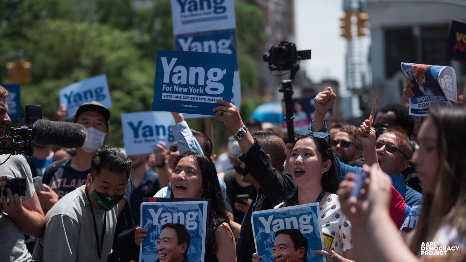
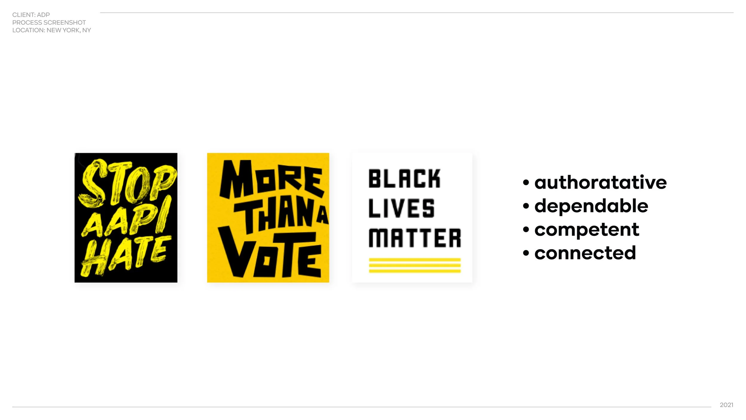
ADP was coming together around the time of George Floyd riots and AAPI hate crimes. They wanted to establish a brand identity that felt resonant with the same kind of power and unity displayed by such organizations as BLACKLIVESMATTER.
Because of its name, we wanted to find an accented wordmark solution that could collapse into their acronym form and maintain its brand identity.

After some iterations with overtly Chinese tones, we dialed back to something much more minimal, arriving at an extremely subtle design rooted in ideas around the American use of the square bracket.
[The Breakout Bracket]
In conventional English symbology what’s in the bracket is something that clarifies, qualifies, or replaces existing information. The idea behind the ADP logo was to break with that concept.
We are Asian Americans.
We’re not here to replace people.
We’re here because we belong.


BRINGING IT TO LIFE
Brand Guides & Assets

In order to convey a history-in-the-making aesthetic, we combined modern and vintage effects, stylizing ADP’s photo assets into exaggerated, half-tone patterns.
We also incorporated both subtle tech-forward, glitched-out textures and more overt homages to their mission through embedded names of the crime victims that inspired them to embark on their mission.

LEARNINGS
Textures go a long way.
ADP had a unique challenge in that they had neither illustrative design capabilities nor past photography for visual assets when they began their organization. By going heavy on generating textures, patterns, and photo effects for them to apply on stock photography, we were able to create a brand identity that popped.