

CELA
ABOUT:
We are a community that supports the growth and evolution of the accelerator education format.
THE ASK:
We need your help to create a brand that feels professional but also ignites the inner child in professionals— a sense of excitement, possibility, and adventure.
DELIVERABLES:
• Logo
• Brand
• Website

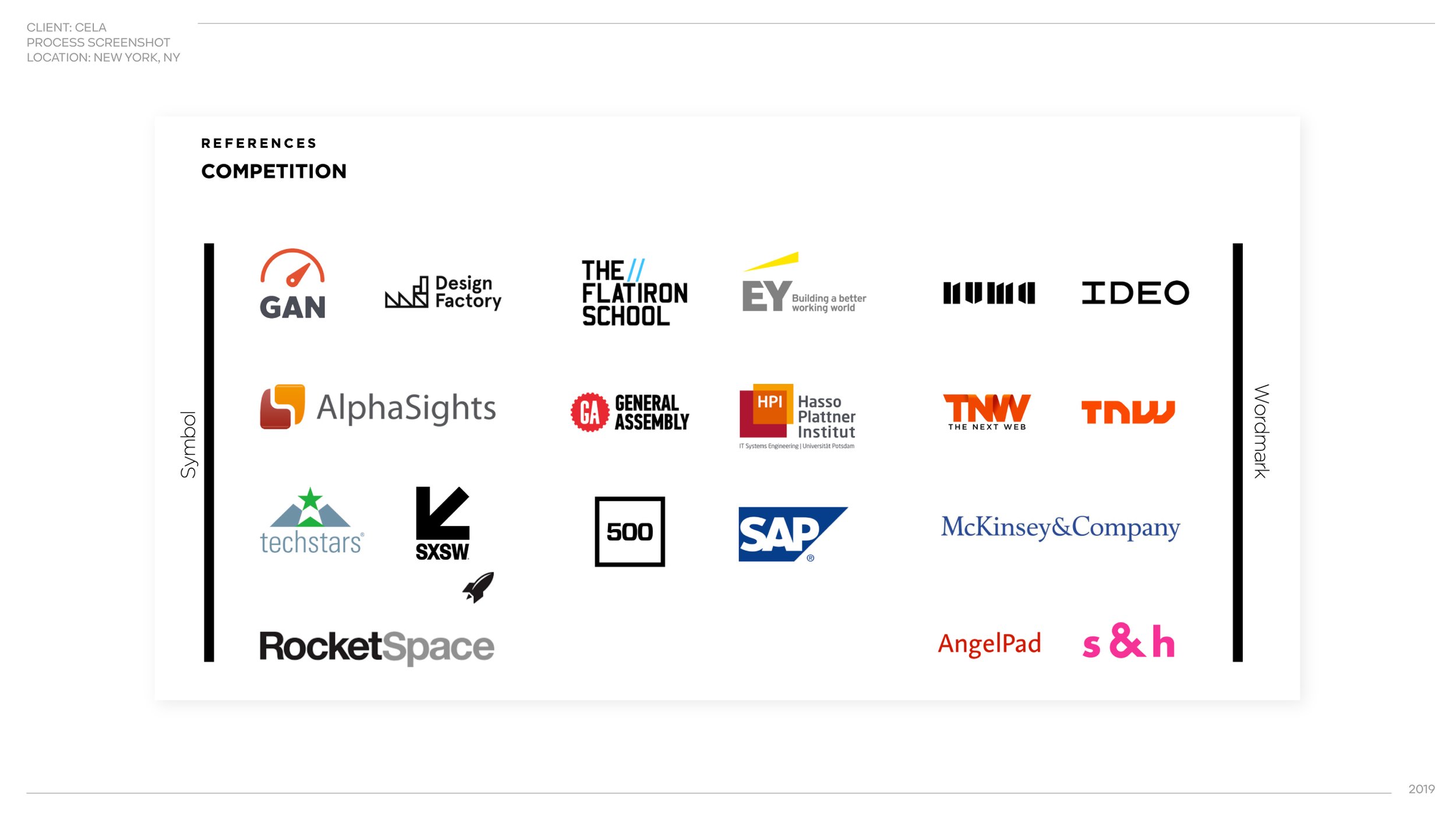
STEP 1
Establishing Direction

CELA had a unique clarity around its brand qualities, because they had separately hired a brand consultant to build their brand identity in basically all ways except visual. Hence, they had their identity down to copy nuances like:
“Do not shy away from being authoritative.”
“Demonstrate ‘warmth’ rationally, with solutions-oriented, responsive, and optimistic messages.”
This level of resolution helped inform the degree of maturity we wanted to aim for in our branding process.


Eventually we arrived at a wordmark that struck just the right balance between competence and approachability.
EXPANSION
Colors & Typefaces

Evaluating against similar competitor brands in the field, as well as emphasizing its distinguishing brand characteristics, we decided to move forward with a combination of royal violet and punchy, fiery accent colors.


Primary typeface was a bold sans-serif (coincidentally called Cera).
LEARNINGS & TAKEWAYS
Great Copy = Great Clarity
One of the things unique about working with Cela was the clarity of their written material. Not only had the founder made the investment to work with a professional to establish their branding strategy down to minute nuances, he was also an adept writer with a clear ability to flesh out copy content to inspire my deliverables.