

Ttwinon
ABOUT:
TTWINON is a Seoul-based after-school program that provides supplementary education to children via currently unconventional methods involving games, acting, and moving.
THE ASK:
We need a logo that feels both fun and exciting for our students and professional enough for parents to trust.

STEP 1
Finding Direction
Ttwinon’s initiation call revealed five main values:
Fun,
Competence,
Growth,
Embracing Mistakes,
Movement.

After a couple rounds of concepts we arrived at a starting direction that felt worth expanding on: the imperfect circle.
The idea wasn’t bad. I liked that it was casual, and I liked that it had “embracing mistakes” element going on. Colors could make it more fun. Professionalism could be captured by refining the shape or pairing it with a more serious typeface.
I wasn’t getting the sense of growth or movement, though, and the ink drop concept felt a little too violent for what we were going for.
STEP 2
Meaningful Imperfections
While I was happy they liked the idea, I knew we had to go further. There are probably hundreds or thousands of logos out there that are simply circles or rings.
The question we needed to ask was:
How might we imbue unique meaning or story into the imperfections of the circle?
While it would’ve been extremely tedious to try to hand-draw some kind of purpose into the outlines of the circle, I got curious what would emerge if I surrendered control of the exact shape.
What if instead of trying to embed meaning into the details, I embedded it into a meaningful process and let the details emerge?
STEP 3
Design via Ritual Sacrifice

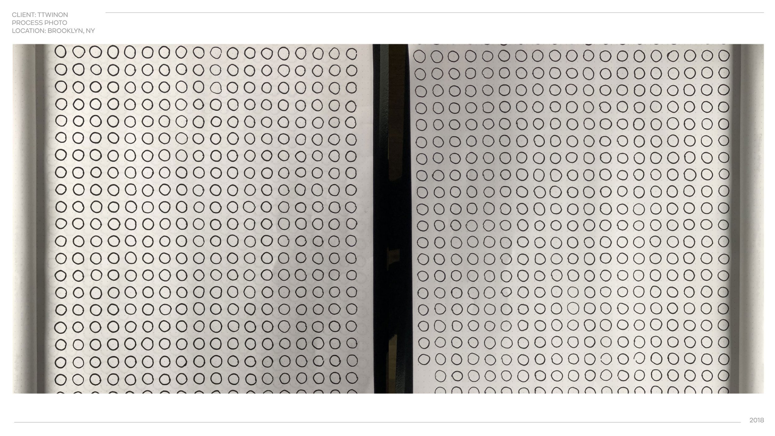
The idea that emerged was, ironically, spectacularly tedious.
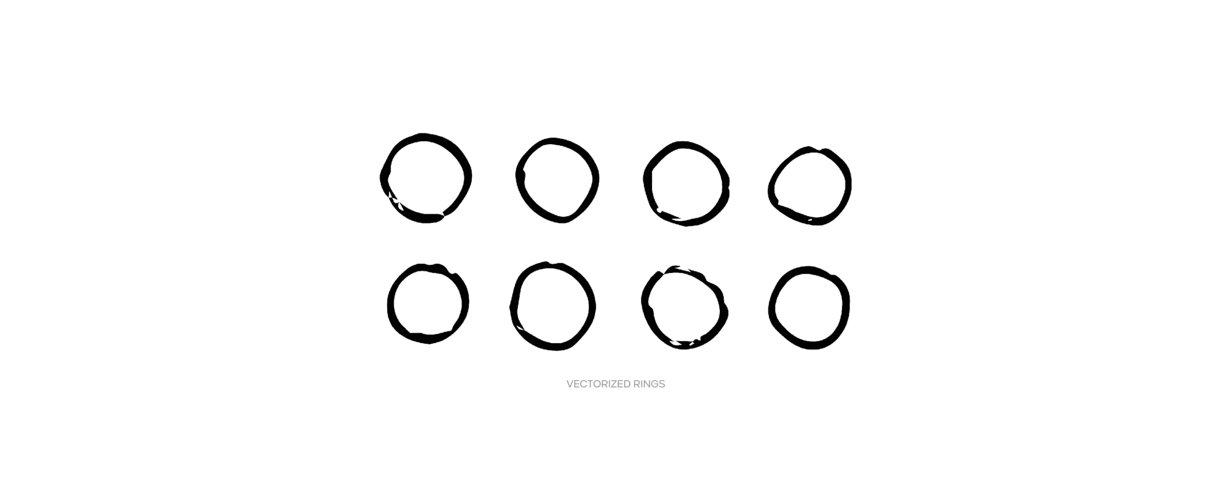
I hand-drew one thousand individual circles, imagining each one as an attempt at an ideal.

I then scanned all the sketches, vectorized them, and overlapped them over each other.

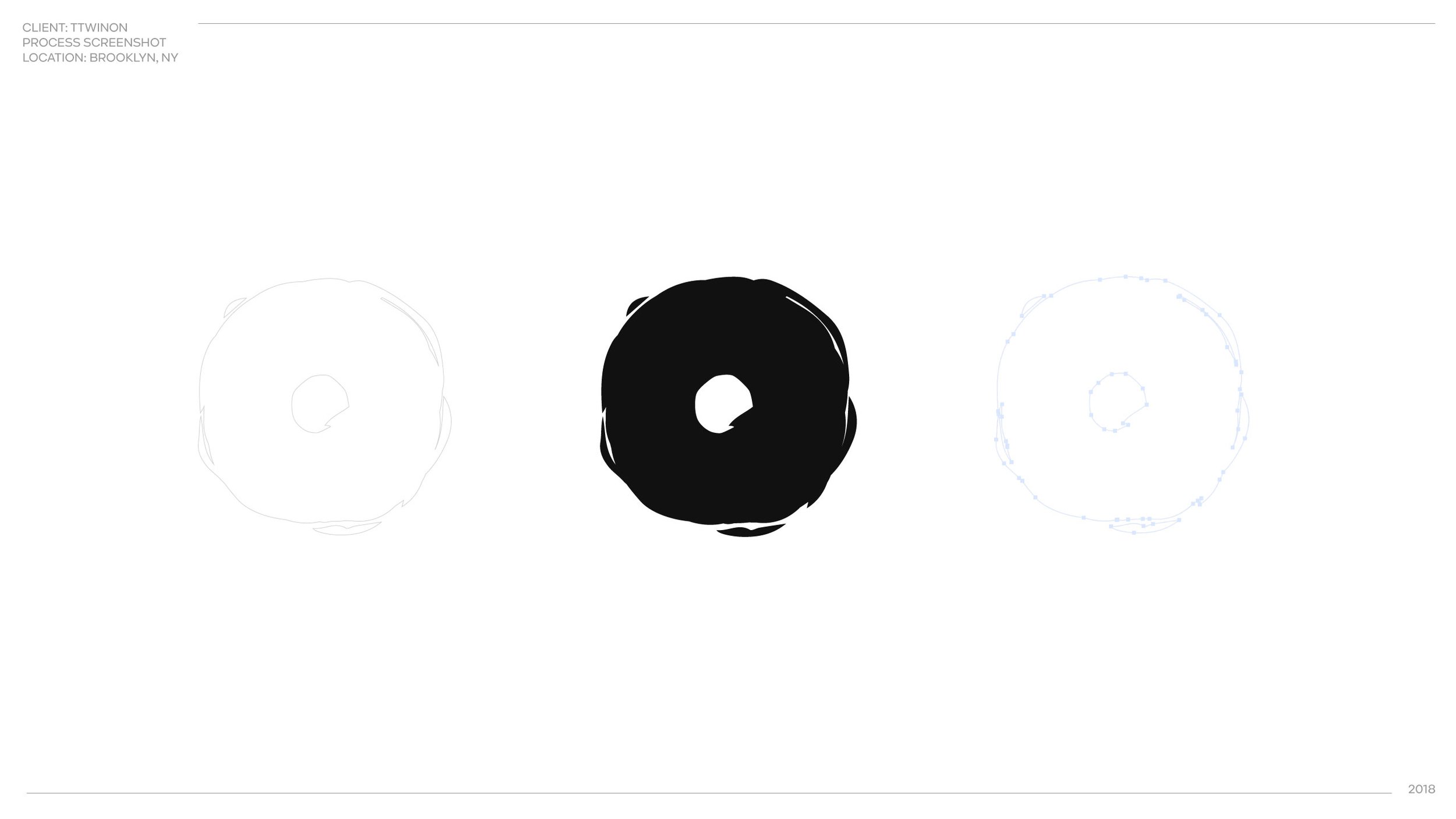
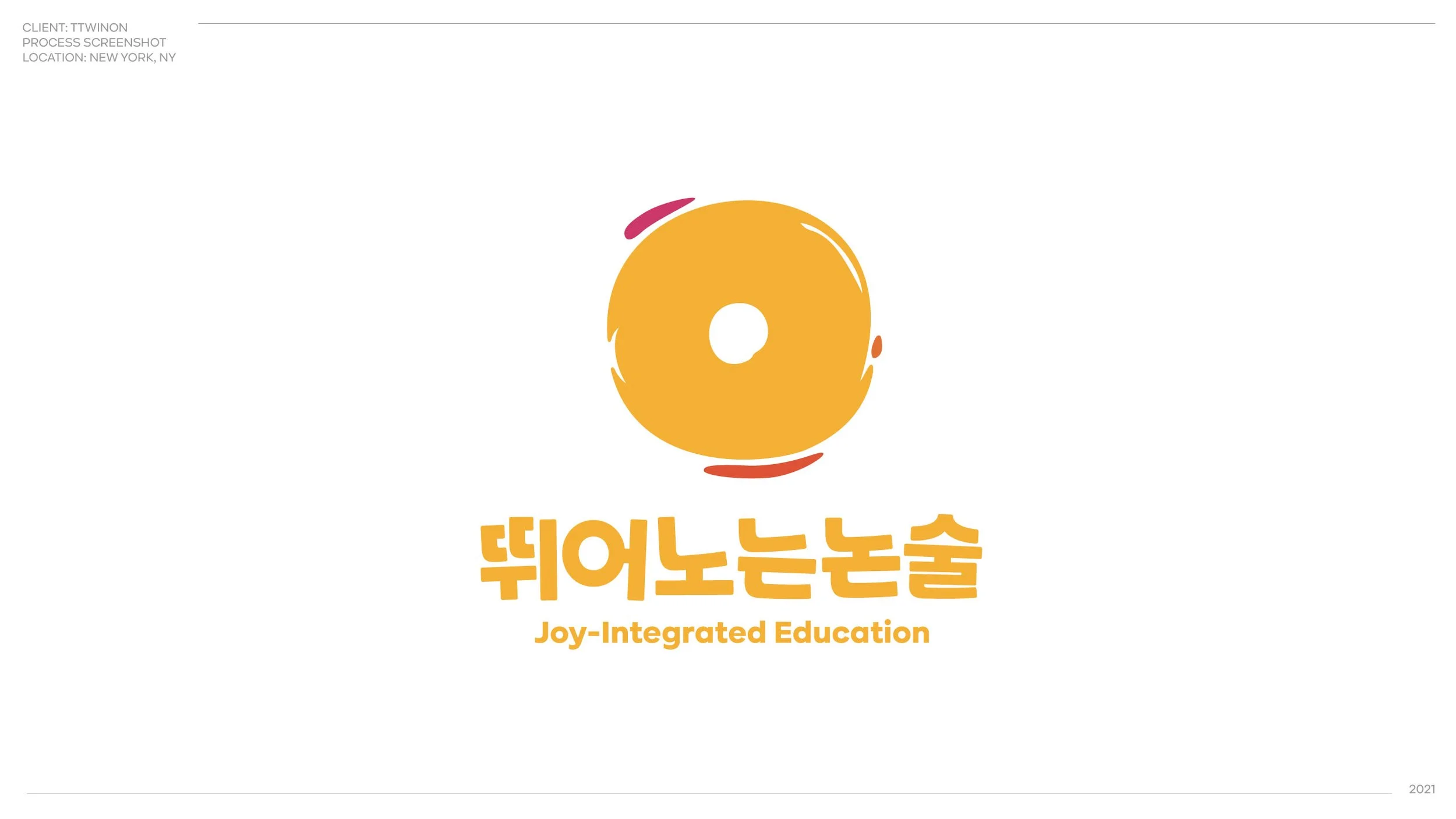
The result: a single, flawed, circular symbol— a light-hearted visual story about one thousand imperfect attempts at an ideal.
STEP 4
Polish to Essence
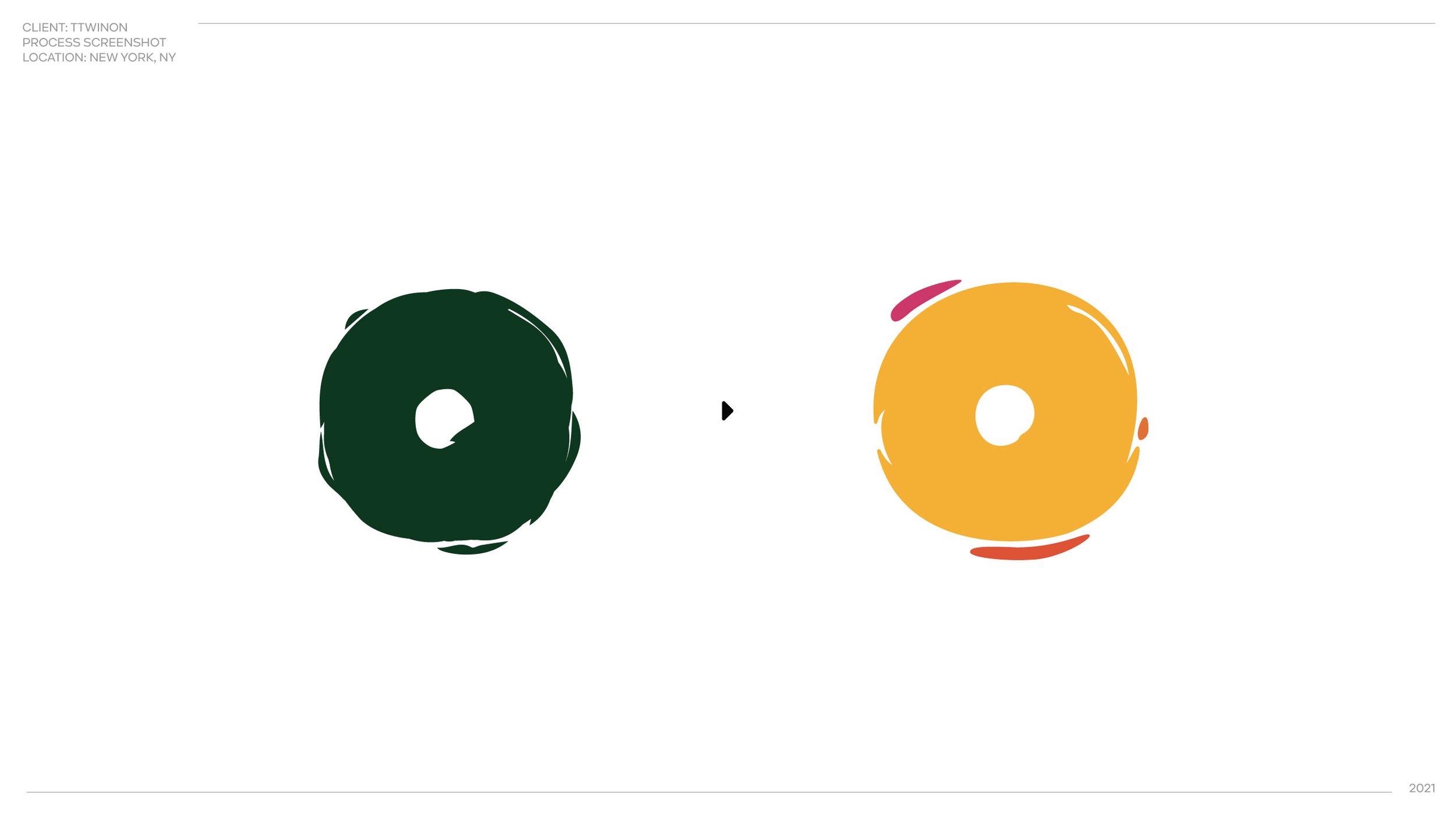
To modernize and dial up the playfulness we smoothed the edges, exaggerated some of its visual quirks, and updated their primary color from their chalkboard inspired green to a more energetic, golden orange.


WHAT I LEARNED
Ultra Clear Values = Ultra Creative Process
Because my clients were clear on what was important to them, they were able to easily see how a simple, lumpy circle could accomplish the feelings that aligned with their brand’s intentions.
As a result of their confidence, we had an excess of time and energy to come up with creative layers I otherwise wouldn’t have been able to to explore.